Problem
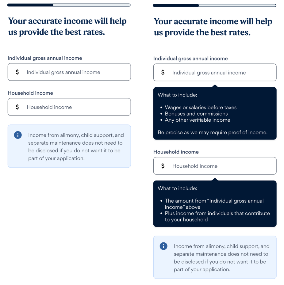
The original income capture experience was confusing and burdensome for users during a high-stakes moment in the application process.
- Instructions were unclear and inconsistent
- Users didn’t understand the distinction between Individual Income and Household Income
- The form required users to do math to estimate figures, creating friction and doubt
This pain point was directly contributing to application drop-off and lower verification rate.

Problem Statement
As a customer applying for a personal loan,
I want to provide my verifiable individual and household income,
but I don’t understand what to enter in each field,
because the instructions are unclear and I need to do math,
which makes me feel frustrated and worried this will impact my application.
Research
Quantitative Feedback
We analyzed customer feedback and uncovered significant usability issues:
- 19% of users found the individual income label and explanation unclear
- 16% reported difficulty estimating their individual gross income.
- 25% found the household income label and instructions confusing
- 20% struggled to provide an accurate household income figure
Competitive Analysis
I led a UX benchmarking effort across direct lending competitors and financial apps to identify:
- Gaps we could leverage for differentiation
- Common terminology and form patterns
- Content strategies that improved comprehension
Internal Workshops
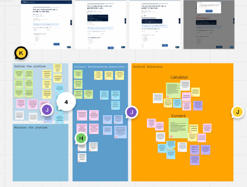
I facilitated collaborative workshops with stakeholders from product, content and insights to:
- Co-create problem statements that guided our design direction
- Align on terminology constraints
- Explore how other teams were solving similar friction

Design
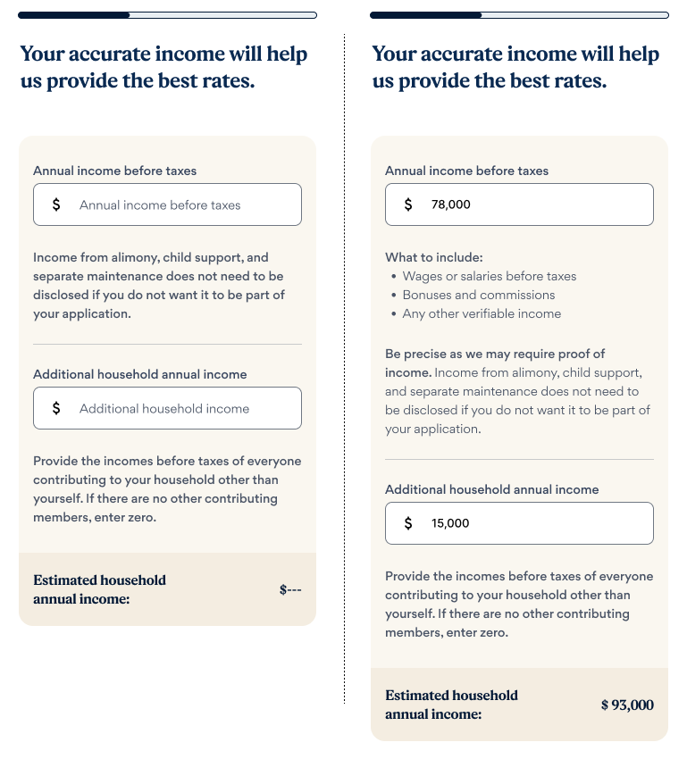
Our solution simplified and clarified the experience through:
- Rewriting labels in plain language to distinguish income types
- Adding microcopy and examples to help users self-identify qualifying income
- Combining inputs into a single estimated income field to reduce decision fatigue
- Improving visual hierarchy for better scannability and confidence
These decisions were documented in our design system and shared with other product pods to ensure consistency.

User Testing
In unmoderated usability tests, 64% of participants preferred the new design over the original. Users cited improved clarity, reduced confusion, and greater confidence in their entries.
Results
The redesigned income capture experience, was launched as a multi-variant A/B test, which led to measurable improvements across key business metrics and became the new control:
- +2.5% App Submit Rate
- +1.30% Offer Rate
- +1.86% Offers Accepted
- +1.25% Funded Offers
My Role
I led the end-to-end UX strategy and execution for this initiative. My responsibilities included:
- Facilitating cross-functional workshops with product, engineering, and compliance
- Synthesizing user and business needs into actionable problem statements
- Leading ideation and A/B testing across multiple iterations
- Mentoring junior designers and contributing to design system updates
- Partnering with analytics to define success metrics and measure outcomes
